Rounded corners are simple until you put one rounded container inside another.
I’ve seen plenty of cards where every individual radius looks perfectly reasonable, yet the whole component somehow feels slightly off. Usually, the problem isn’t the amount of rounding. It’s the relationship between the inner and outer corners.
There’s a simple rule I use as a starting point:
Outer radius = inner radius + padding
Padding Changes the Radius You Need
Say I have an inner container with a 16px border radius and 8px of padding around it.
Using 16px for the outer container as well might sound logical. After all, they’re part of the same component.
Visually, though, the curves won’t follow each other.
The outer edge sits 8px further away, so its radius needs to account for that distance:
16px + 8px = 24px
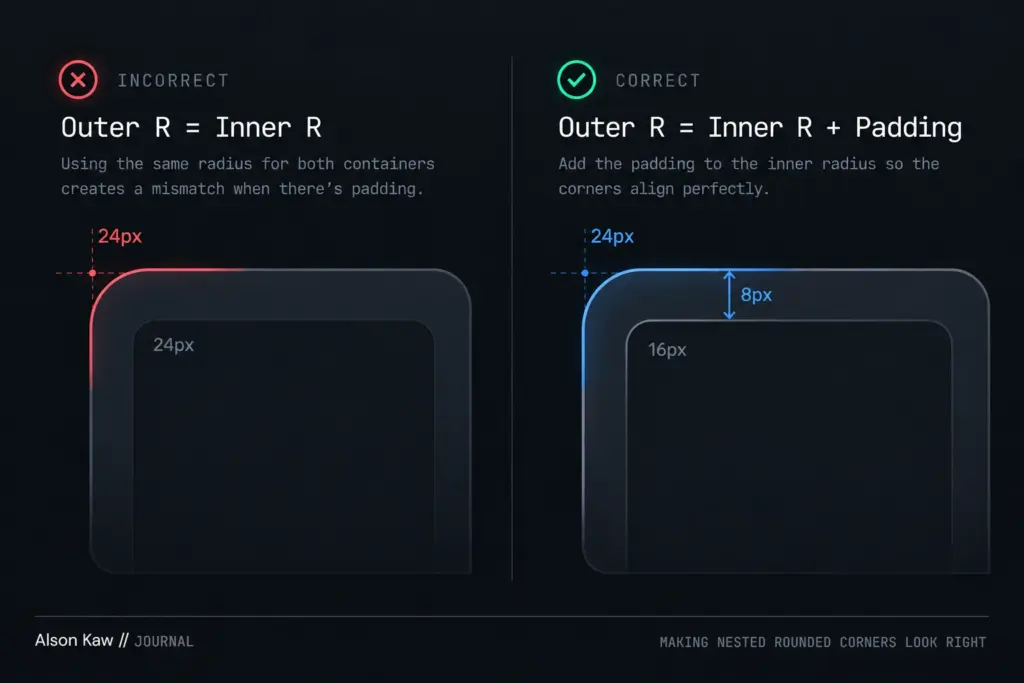
Suggested caption: Matching the inner and outer radius ignores the space between them. Adding the padding keeps both curves aligned.
In CSS, that relationship is simply:
.card {
    padding: 8px;
    border-radius: 24px;
}

.card__inner {
    border-radius: 16px;
}
Code language: CSS (css)
It’s a tiny detail, but once you notice badly matched nested corners, they’re rather difficult to unsee.
The Formula Gets Awkward With More Layers
The basic rule works nicely with two surfaces.
Things get more interesting when a design has several nested containers.
If I start with a 24px radius and subtract 8px at every level, I get:
24px → 16px → 8px → 0px
I’ve gone from nicely rounded to completely square in four layers.
There isn’t anything mathematically wrong with that result. The problem is that I’m trying to make a geometric rule do the job of a visual system.
For deeper nesting, I prefer to reduce the difference progressively:
24px → 16px → 12px → 8px → 4px
Instead of blindly subtracting the same amount forever, I reduce the spacing as the elements get smaller.
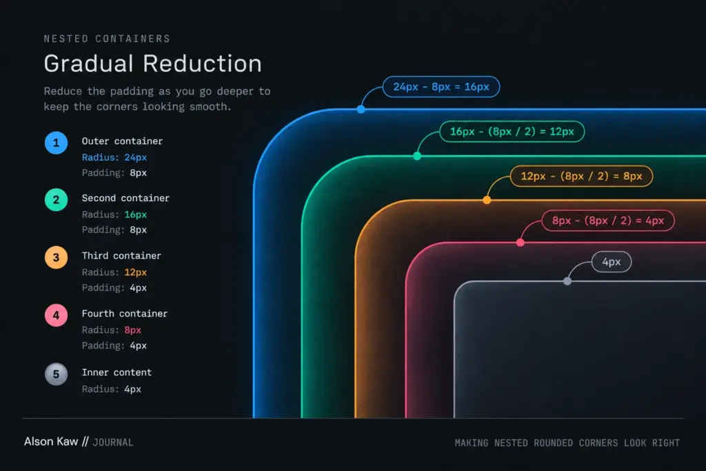
Suggested caption: With deeper nesting, progressively smaller radius and padding values preserve the visual rhythm without forcing the innermost element to become square.
This isn’t the same geometry as outer radius = inner radius + padding with a constant 8px gap.
It’s an intentional visual adjustment.
And that’s the important distinction.
Treat Border Radius as a Relationship
A nested component might therefore use something like:
Outer container    24px
Second container   16px
Third container    12px
Fourth container    8px
Inner content       4px
Code language: plaintext (plaintext)
I don’t think the exact numbers are particularly important.
What matters is that I don’t choose each radius independently because 24px, 16px or 12px happens to look good on its own.
Each corner belongs to the one surrounding it.
The same applies to padding. Smaller inner elements don’t necessarily need the same 8px separation as the much larger outer surfaces.
Thinking about the two together produces much more natural-looking components.
Don’t Over-Engineer the Corners
There’s also a point where carefully calculating five different radii probably means I’m solving the wrong problem.
If a card has layer after layer of backgrounds, borders and rounded containers, I’ll usually question whether all those layers need to be visible.
Two or three surfaces can establish hierarchy.
Five can start looking like Russian nesting dolls designed by a CSS framework.
Border radius is one of those details most people will never consciously notice when it’s done well.
They’ll notice when it isn’t.